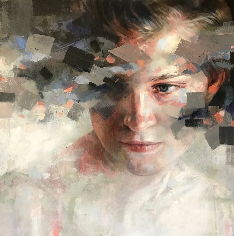
Ever wonder why some oil paintings really 'pop' while yours just wont? Try glazing.
Glazing is a technique used within painting where transparent layers of paint are layered upon earlier layers of (usually opaque) paint that have already dried. Glazing is an amazing technique used within oil painting and understanding and using glazing effectively will really give you that "oil painting" feeling. When glazing an oil painting it is possible to give your painting a feeling of luminosity that is impossible to achieve otherwise. Glazing was also used by the old masters to create colours that were hard to find or impossibly expensive, for example, blue can be glazed over an underpainting of a red gown to create a royal purple garment.
Just a note, if you haven't read my post on whites and on how to read paint labels perhaps do so first, as it will make the following technical terms easier to understand.
Let's start by discussing mediums and pigments:
A medium is usually a mixture of solvent and oil, kept separate from your oil paint and mixed in when needed to give the paint the desired consistency. Usually this translates to a 50/50 mixture of linseed oil and artists turpentine. There are however a multitude of recipes. Some good guidelines however are to never use more than 50% solvent (turps - as it will literally dissolve the pigments in your paint) and to never use vegetable oil but to keep to refined oils such as linseed, poppy seed, walnut and spike oil, which tend to yellow less over time than others. Another tip is to never use Damar Varnish in your medium, if the painting is ever restored, or even if you would want to rework the painting, you'd have to strip down the varnish and so doing disintegrate the painting.
All mediums are considered to be "fat", while opaque pigments without medium are considered "lean". Fat is always over lean. When starting a painting it is crucially important to have a lean opaque underpainting, adding in more medium as you approach the top most layers. Adding lean over fat, instead of fat over lean will result in cracking as topmost layers will dry before bottom layers. Adding in more medium on top of leaner layers will also result in your oil soaking through the lean layers, which is a good thing.
Here are a few recipes for mediums which I found on Art Babel
Easy Formula: 1/2 Refined Linseed oil, 1/2 Turpentine (vary quantities according to viscosity that you want) This is pretty quick drying and good for sketching and painting fast. However, it's not great for layers of delicate color - too much solvent. 2/3 oil, 1/3 solvent is much better for that purpose.
Vincent Desiderio's formula: 1/3 Venetian Turpentine, 1/3 Sun-thickened Linseed Oil, 1/3 turpentine
Adrian Gottlieb (which he says was taught to him by "Scott" at Charles Cecil's Studio): 1/2 Sun-thickened walnut oil, 1/4 Canadian Balsam, 1/4 Turpentine
When glazing, instead of just adding small quantities of medium to your paint, you will deliberately either add pure colour to a small pot of medium or mix in a lot of medium with your paint on your palette to create a very runny paint. This is then applied over any dry underpainting that you already have. Depending on what colours you add to your medium to make a glaze, the effects will vary greatly. Glazing is a great tool to manipulate the warm and cool areas of your painting. Generally speaking, diluting a transparent pigment with a medium will result in a warmer glaze and is called a Traditional Glaze. When using a colour that is lighter than the underlayer and is only semi-transparent, the glaze will cool the painting and is called a Velatura. This type of glaze usually contains white.
Pigments, is what your paint is made from. To be able to glaze effectively it is important to know if the pigment you are using is transparent, semi-transparent or opaque, and also how strong the pigment is. It is also important to use a high quality paint for glazing, as many cheaper paints do not have the high transparency levels that their more expensive counterparts do. Sap Green is a great example of this.
Maimeri Puro, Avignon Orange & Sennelier Indigo Hue
The following handy list, which I also found on Art Babel, describes the effects that different colours will have when glazing a painting with them.
Indian Yellow — warm yellow makes painting look lit by sunlight
Transparent Orange — warm orange
Perylene Red — cool red with yellow undertone
Quinacridone Red — cool red replacement for Alizarin and makes high key tints
Quinacridone Magenta — cooler high key red
Quinacridone Violet — clean, warm violet
Dioxazine Purple — cold purple that can be used for a black
Manganese Blue Hue — cool (leans toward green) transparent blue
Phthalo Blue — 20th century replacement for Prussian Blue (also slightly greenish)
Phthalo Green — cold, dark green with great transparency and tinting strength
Phthalo Emerald — warmer, more natural looking Phthalo Green
Here is an example I recently did:
Glazing is not a once off process but a continual journey of watching what the glaze does, and then finding out if it should be partially ( or completely!) wiped off, or if it needs a thicker glaze, or perhaps deciding that another colour would work better.
Remember that any transparent or semitransparent colour can be used, and in the end it is important to experiment (and fail!) to be able to know what works best for you and the effect that you would like to create on each unique painting.


